From a rough sketch to a clean drawing: how I use AI on messy visual input
A phone photo of a sketch is just pixels. Here is how I turn it into clean, structured data you can edit, style and check, using a desk lamp as the example.
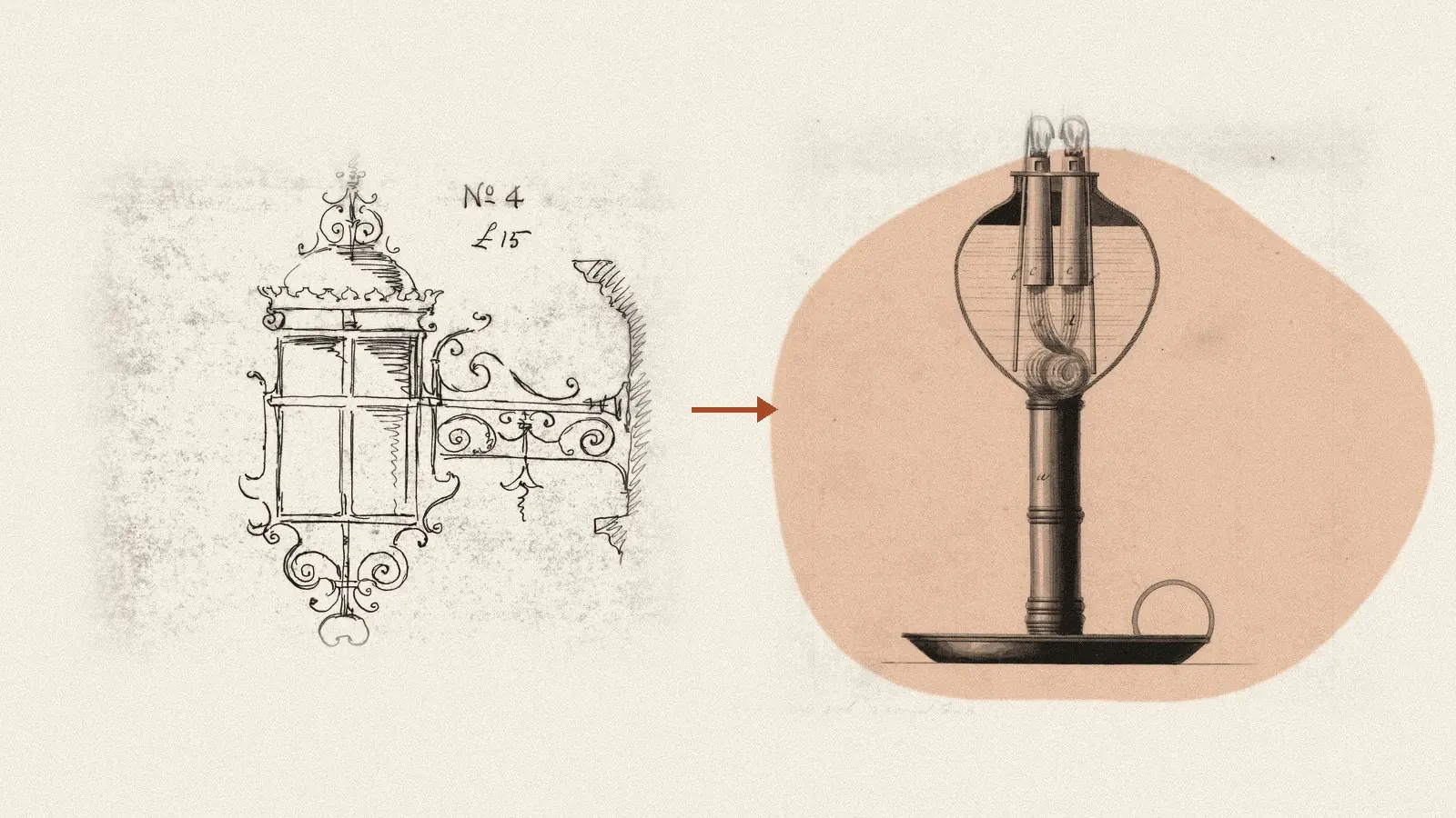
Someone sends you a phone photo of a page. A desk lamp, drawn in pen, a bit crooked, with a coffee ring in the corner.
The question is always the same: can AI turn this into a clean drawing we can actually use?
Short answer: yes, but not in one step. Here is the pipeline I use, with that lamp as the running example. The images are illustrations of the approach, not client work.
Step 1: clean the input
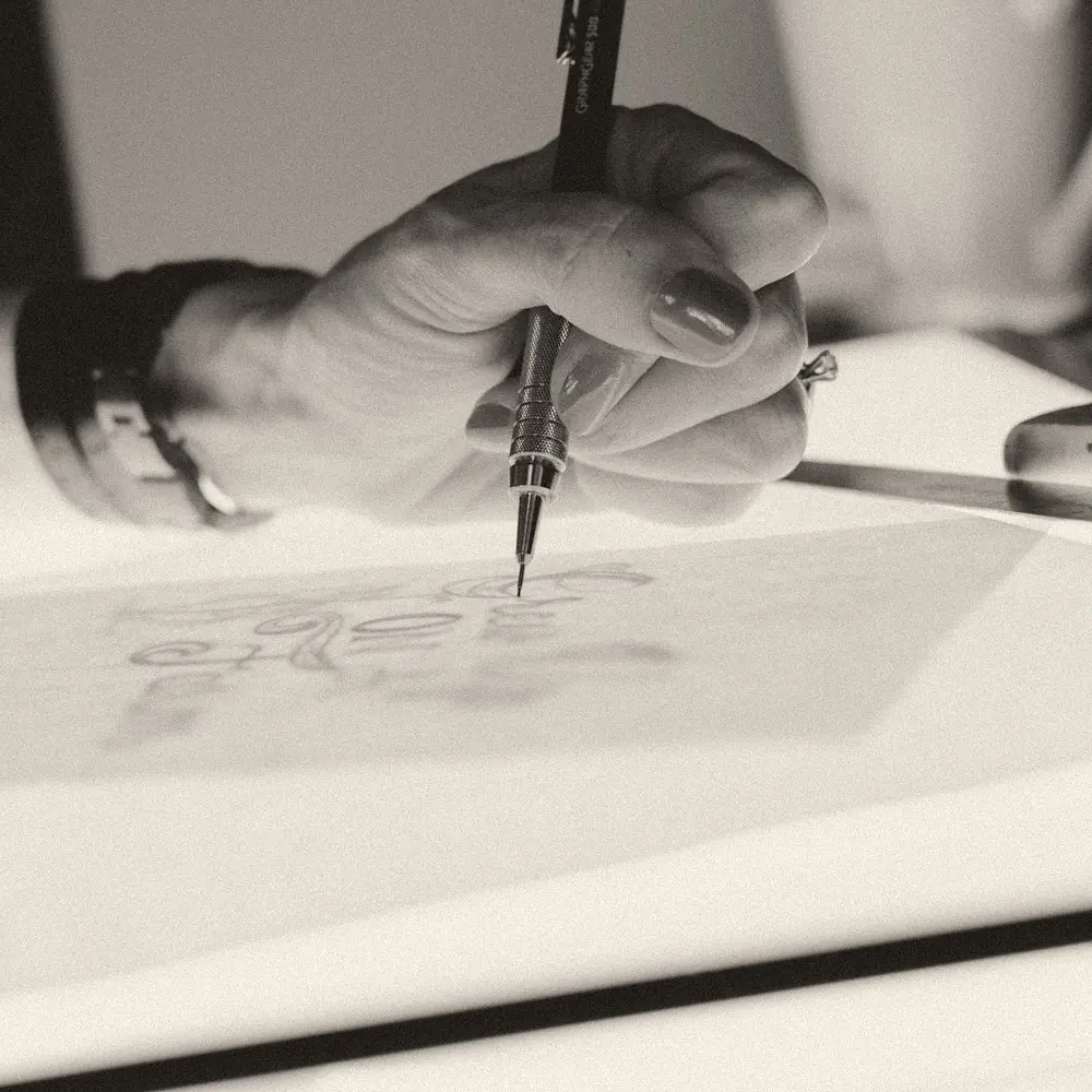
A phone photo of paper is messier than it looks: a tilted page, uneven light, paper grain and shadows.
First I deskew the image: straighten the page and fix the perspective if the photo was taken at an angle.
Then I denoise it (remove speckles and paper texture) and fix the contrast. Adaptive thresholding works well here. It decides black or white region by region, so a shadow over one corner does not swallow the lines.
Next comes line extraction. For soft pencil or busy photos, edge detection helps first: it finds where brightness changes sharply, which is usually where a line is. For clean pen drawings I go straight to black and white and then thin the result, also called skeletonisation. Every stroke shrinks to a line one pixel wide that runs through its centre.
Last, I drop helper lines, shading and hatching. They are usually fainter, shorter or packed close together, so simple rules on stroke strength, length and density remove most of them.
It is tempting to skip this and send raw photos straight to a model. Good photos look fine. Bad ones give confident nonsense, and you cannot tell what failed. So cleaning comes first, and I keep its output to inspect.
Step 2: find the shapes
After step 1 the sketch is clean lines, but it is still pixels. The goal now is to turn pixels into data.
I vectorise the strokes. The thin lines become paths made of points and curves, like in an SVG file. Then I simplify them, so a shaky line becomes a few clean segments.
Then I fit primitives, simple shapes like lines, circles, ellipses and cones. A wobbly oval becomes an ellipse with a centre, width and height. Two lines and an ellipse become the cone of the shade.
Geometry tells me which shapes exist. It does not tell me what they are. For that I use a vision-language model, a model that looks at an image and answers in text. It gets the cleaned image plus the fitted shapes and names the parts: base, arm, joint, shade.
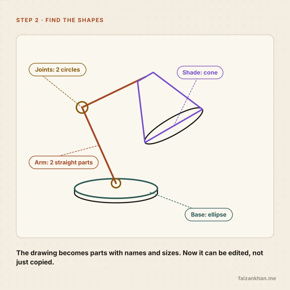
The model returns structured JSON: each part with its type, its size and how it connects to the others. One entry might look like {"part": "arm", "segments": 2, "connects": ["base", "shade"]}.
I validate that JSON against a schema before anything else touches it. A schema is a strict description of the allowed fields and types. If the arm has no segment count, or the shade is not attached to anything, the result is rejected and retried, not quietly passed on.
One rule I hold firmly: the model names, the code measures. Vision-language models are good at saying what something is and weak at exact sizes. So lengths, angles and ratios come from the fitted geometry, not from the model's guess.
The drawing becomes data you can edit, not just pixels.
Now you can lengthen the arm, swap the shade or check the base width. None of that works on a picture.
Step 3: style it
With the structure in hand, there are two ways to make the final image.
The first is to render from the structure. The parts become a clean vector drawing with your line weights and brand colours, set exactly in code. Same data, same picture, every time. For technical drawings and diagrams this is usually the right choice.
The second is to use an image model when you want something richer, like a catalogue image with materials and light. The key word is conditioning. With ControlNet-style conditioning, you give the image model the line art, or a scribble, as an extra input next to the text prompt. The lines hold the shape. The prompt only changes the style.
A strength setting controls how strictly the model follows the lines. Too loose and the shape drifts. Too strict and it looks flat. I tune it on several test sketches, never on one.
Colour is the weak spot here. Models treat colour words loosely, so I check the output against the brand palette instead of trusting the prompt.
Why words alone fall short
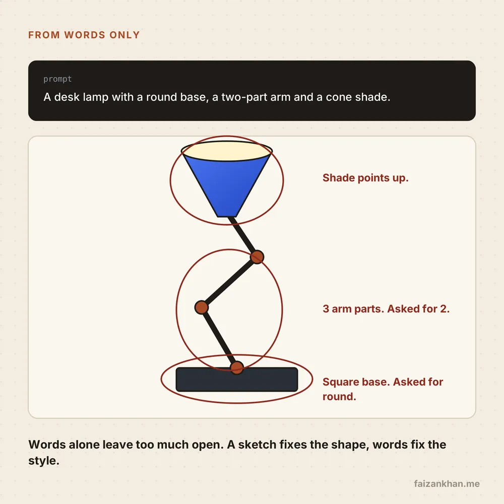
A fair question: why not skip the sketch and just describe the lamp?
Ask a text-to-image model for a desk lamp with a round base, a two-part arm and a cone shade. You will get something that looks like a lamp. Look closer and the details drift: three arm parts instead of two, a square base, a shade pointing at the ceiling.
This is not a bug in one model. Text leaves most of the shape open, and the model fills the gaps with what lamps usually look like. Counts and directions are where it guesses most.
A sketch removes those guesses. Words then do what they are good at: material, colour, light and mood.
A sketch fixes the shape. Words fix the style.
Keep a human in the loop, and measure
A pipeline that is right most of the time still needs someone to look at the rest. I build review in from the start.
The reviewer sees the sketch next to the result and the parts list. They fix a name or a size in the structure and re-render. Nobody edits pixels.
Automatic checks run before a human sees anything. Does the part count match the sketch? Are the proportions within a tolerance of the fitted geometry? Did the JSON pass the schema? Anything that fails goes straight to review.
I also keep a small test set: twenty or thirty real sketches, from neat to terrible, each with the expected parts and rough sizes. Every change to any step runs against that set. I track part-count accuracy, dimension error, schema failure rate and how many outputs needed a human fix.
That last number is the honest one: does the pipeline save time, or just move the work?
Where this helps
The lamp is only an example. The same steps work wherever input arrives on paper or a whiteboard:
- Hand sketches or scans turned into clean, consistent drawings.
- Catalogue images in one shared style, made from rough drafts by different people.
- Whiteboard photos turned into editable diagrams, with boxes and arrows as data.
- Old scanned drawings brought into a format you can search and change.
The value is not the pretty image. It is the structure behind it, which you can check, edit and reuse.
What I would tell you
- Clean first. Deskew, denoise and extract lines before any model sees the input. Most of the quality is decided here.
- Turn pixels into data. Fit shapes, name the parts and validate the JSON against a schema.
- Let the model name and the code measure. Sizes come from geometry, not from a guess.
- Sketch for shape, words for style. Condition image models on line art so the shape cannot drift.
- Measure on a small fixed set. Part counts, dimensions and human fixes per output tell you if it works.
Working on something like this?
Tell me what you are building and where you are stuck. I will tell you honestly if and how I can help. Or email hello@faizankhan.me.

Muhammad Faizan Khan is an AI and data engineer in Berlin. He builds AI agents, data platforms and the software around them. More about me.